Advocacy & Statistics
Many times in graduate school and now in my position as a research scientist, I have found myself in the position of defending the importance of efforts towards broadening who is participating in STEM fields. Conversations about diversity are much easier with other SACNISTAs – there are shared experiences and a natural empathy to the challenges of being underrepresented in an academic department. The same conversation with another academic can invoke feelings of frustration, comments and questions that make me wonder if we’re even on the same planet.
In spite of the frustration, I decided that if I wanted to improve my advocacy skills and help change campus culture it was important to not avoid those conversations. I found through trial and error that if I’m talking to quantitative scientists about why we should be making efforts towards diversity, I should speak in numbers. I don’t mean to paint all academics with a broad brushstroke, but having quantitative evidence infuses advocacy for diversity efforts with the kind of rigor that other academics recognize. It’s speaking the language of the institution so you can start breaking down skepticism and move conversations beyond the need to defend why you spend time and energy towards increasing diversity.
Helpful resources
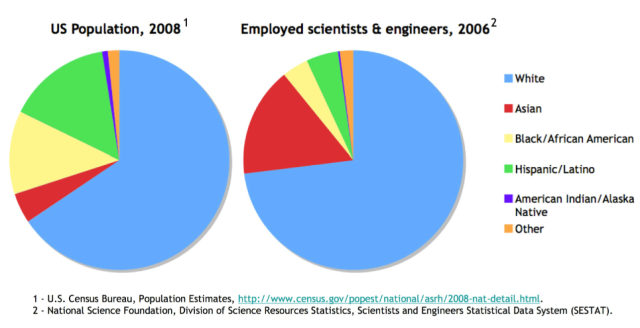
The National Science Foundation has an interactive website with statistics for women, minorities and persons with disabilities in science and engineering. The site takes some navigating, but there is a wealth of up-to-date information – one nice feature is that they include descriptions the U.S. demographics on the site. This allows you to illustrate visually how underrepresented some groups are in science and engineering. There are limitations to the data sets. For example, Native Hawaiians/Pacific Islanders and multiple-race are grouped as ‘other’ in employed scientists and engineers from 2006.

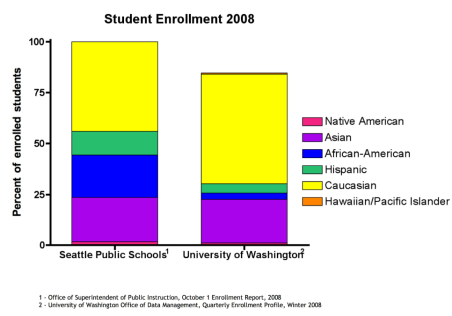
Quantitative descriptions of what schools in our communities look like have also been valuable in my work bridging the university and K-12 education efforts. UW academics are often stunned by how diverse Seattle Public Schools are, especially when compared with the university’s student body.  Two sites that are particularly helpful in capturing the differences include the Washington State Office of Superintendent of Public Instruction and UW Diversity.
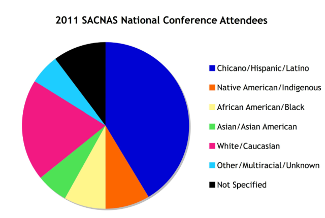
For the purposes of talking about SACNAS as a tool for enhancing diversity for groups beyond Hispanics/Chicanos and Native Americans, statistics from the 2011 conference are great tools for demonstrating how the SACNAS National Conference draws a diverse audience.
 Challenges using social science
Digging into the statistics does take time and my training is not as a social scientist. I’m trained as a natural scientist and when I speak about diversity, I’m usually talking to other natural scientists about social science. My presentations of quantitative data are often the first time the audience has seen any kind of data connected to assertions about diversity in STEM. Because I’m using data to illustrate broad points, I have found that it’s sufficient to my audience to be transparent about what I did with my data and why even though I’m sure some of it would make a rigorous social scientist cringe.
There are cases where you want to compare data from sources that don’t represent the same year, race/ethnicity categories, etc., but keep in mind that you can still use imperfect comparisons to make broad claims. In the first figure above, I want to compare U.S. population and employed scientists and engineers from the same year but I didn’t want to use the archived U.S. population data from the NSF site because it added Native Americans to the category of ‘other’. The US Census Bureau has population data from 2006, but the site is much harder to navigate than NSF. Since it’s reasonable to assume the U.S. population demographics wouldn’t shift radically between 2006-2008, I used data sets from two different years.
It’s also important to be aware that for some demographic data, population totals won’t add up to 100%. In some data sets, ‘Hispanic’ is an ethnicity that is separate from race and people under this label are counted in more than one category.
There are many tools and strengths that SACNISTAs bring to the table when we’re advocating for diversity in STEM. Quantitative data are valuable additions to our advocacy toolbox.
Amanda Bruner is a Research Scientist & Outreach Coordinator at the University of Washington. Her current position with SoundCitizen is focused on broadening public participation in environmental research.
This is great, Amanda! As a demographer and someone who has worked with diversity, I’m glad to see there are other advocates. Keep up the good work!
[…] Bonaparte, who wrote about the implications of world population growth, Amanda Bruner, who wrote on Quantitative Advocacy and Productive Group Planning; the aforementioned Katrina Claw, who wrote about Communicating […]